Typefaces
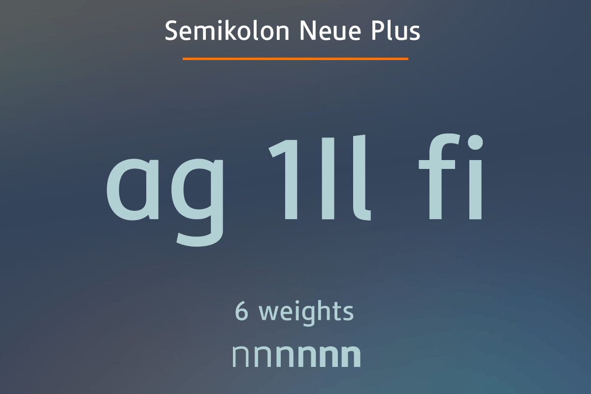
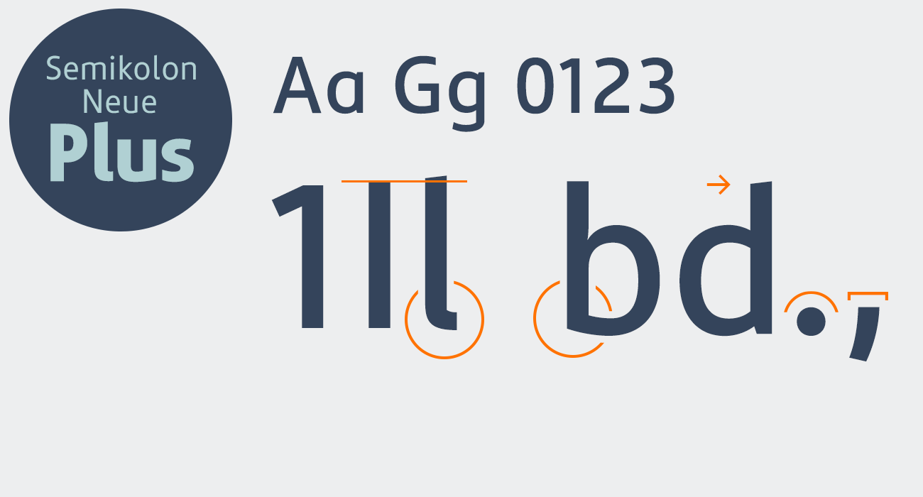
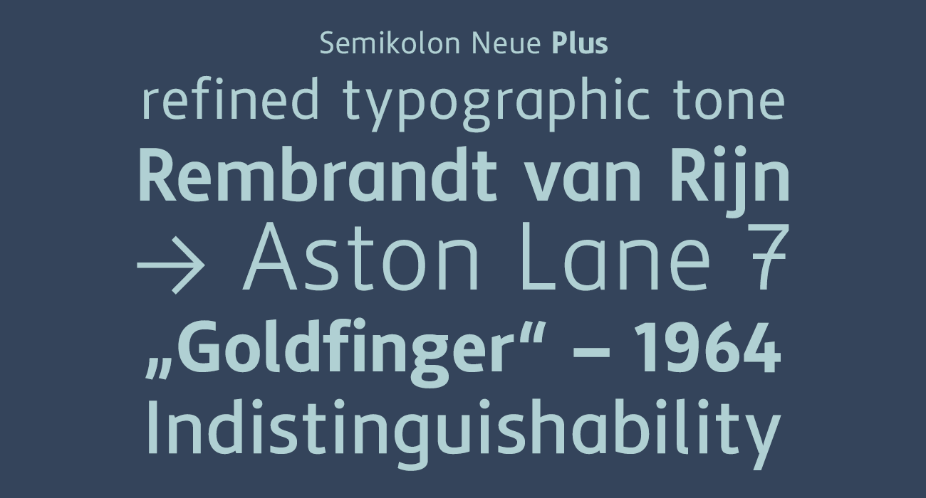
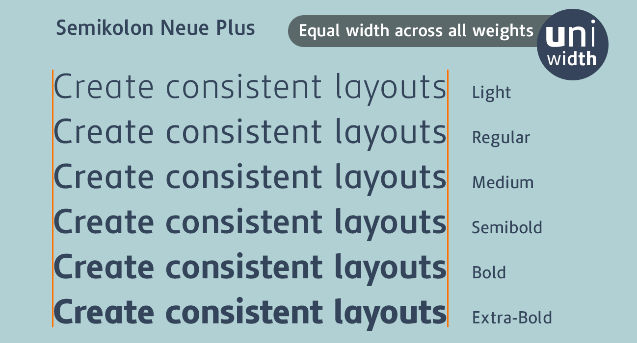
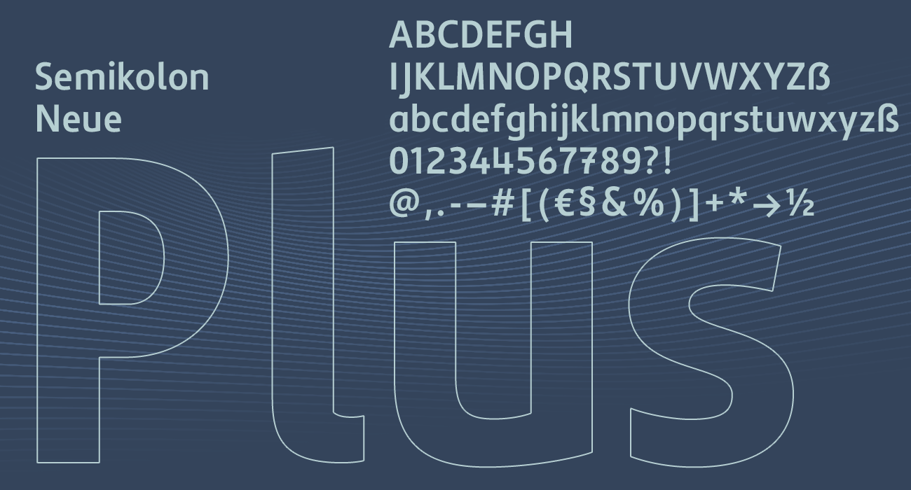
Semikolon Neue Plus
The clear typeface for an easy start in reading.
- Minimizes common letter confusions
- Supports beginning readers and learners
- Proven in adult education by the Federal Association for Literacy and Basic Education (Bundesverband Alphabetisierung und Grundbildung e. V.)
- Single fonts & package
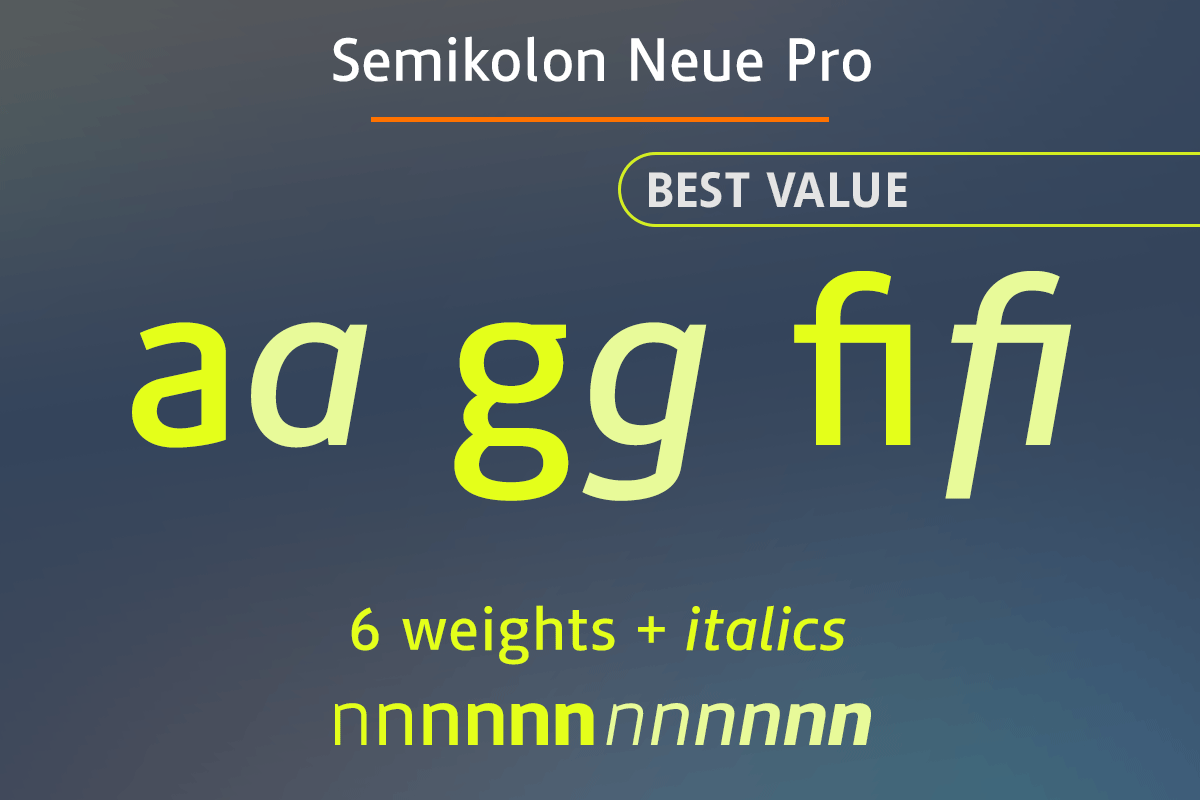
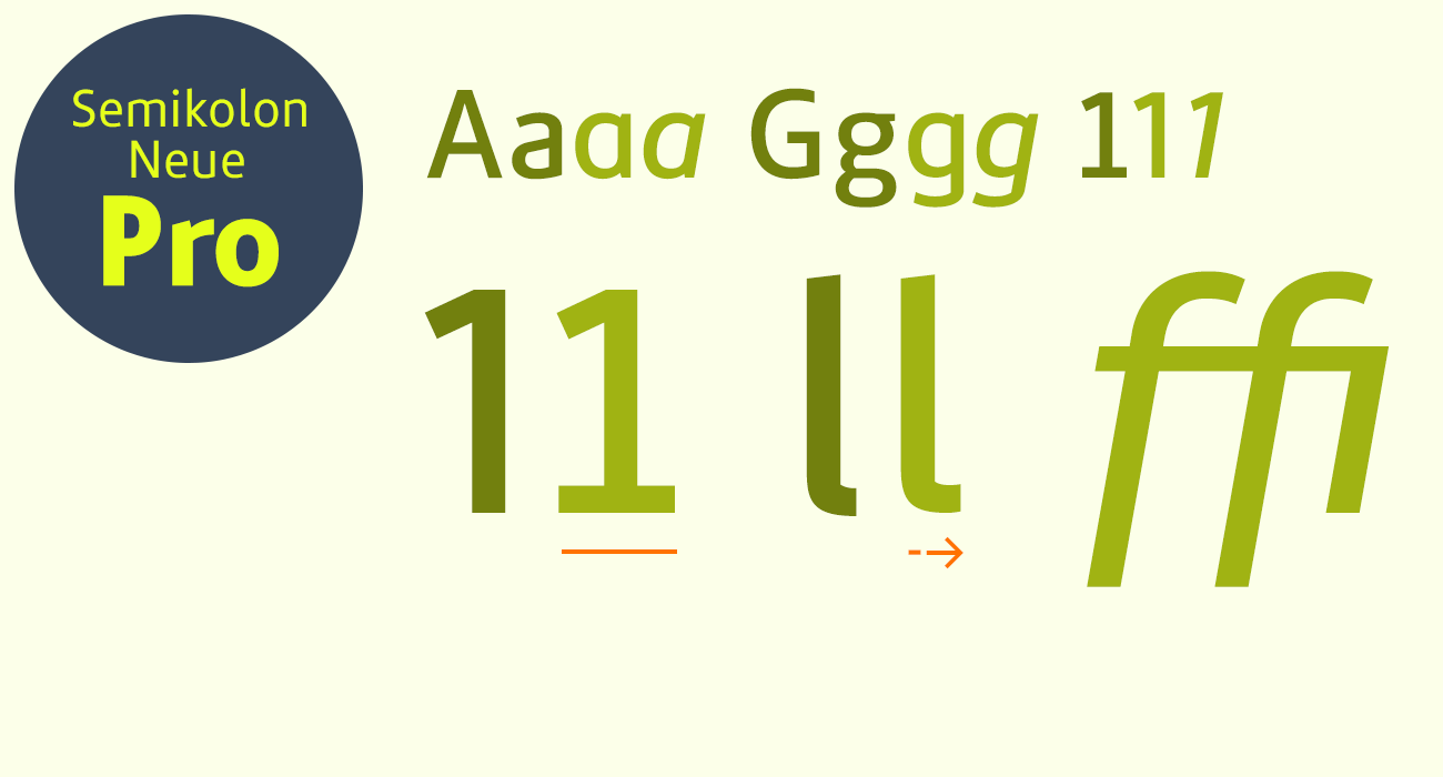
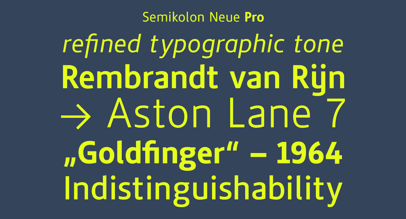
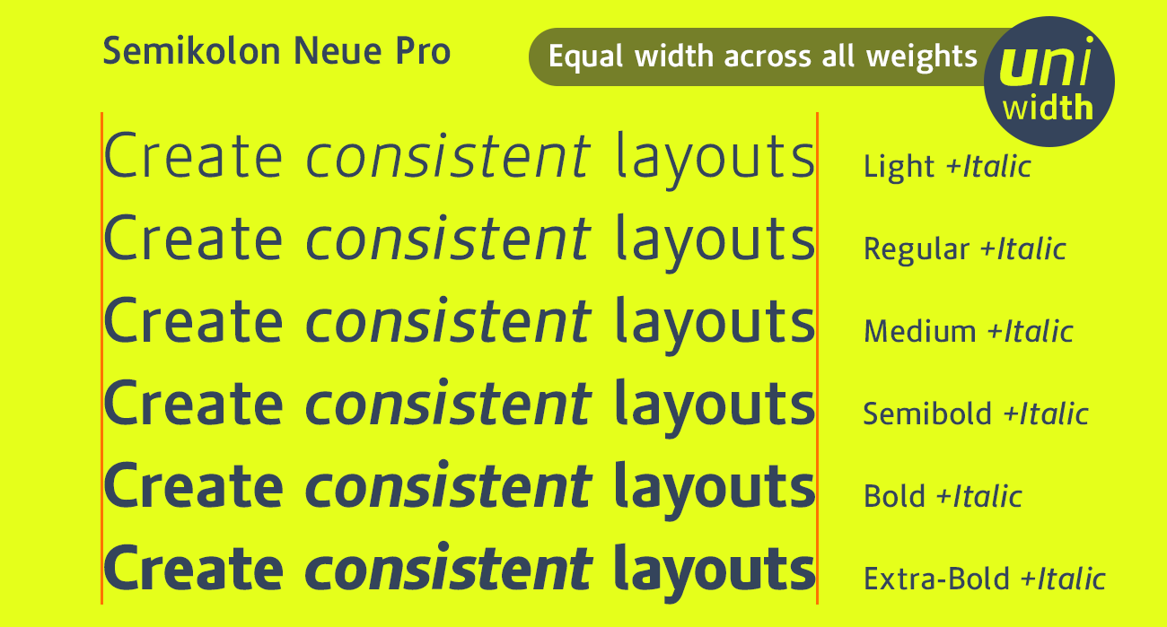
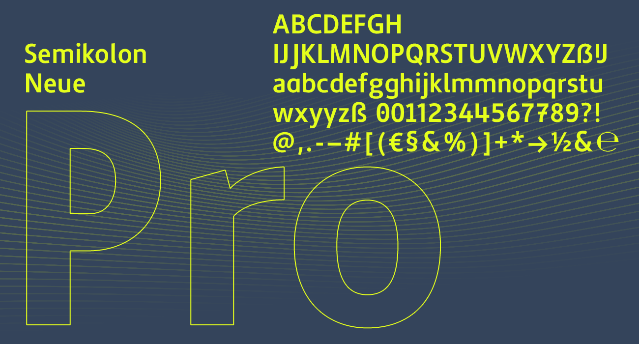
Semikolon Neue Pro
The flexible type system for professional design.
- Advanced OpenType features, tabular figures, and true italics
- Extensive glyph set for international, multilingual projects
- Ideal for corporate design, interfaces, and editorial work
- Single fonts &
best value as package

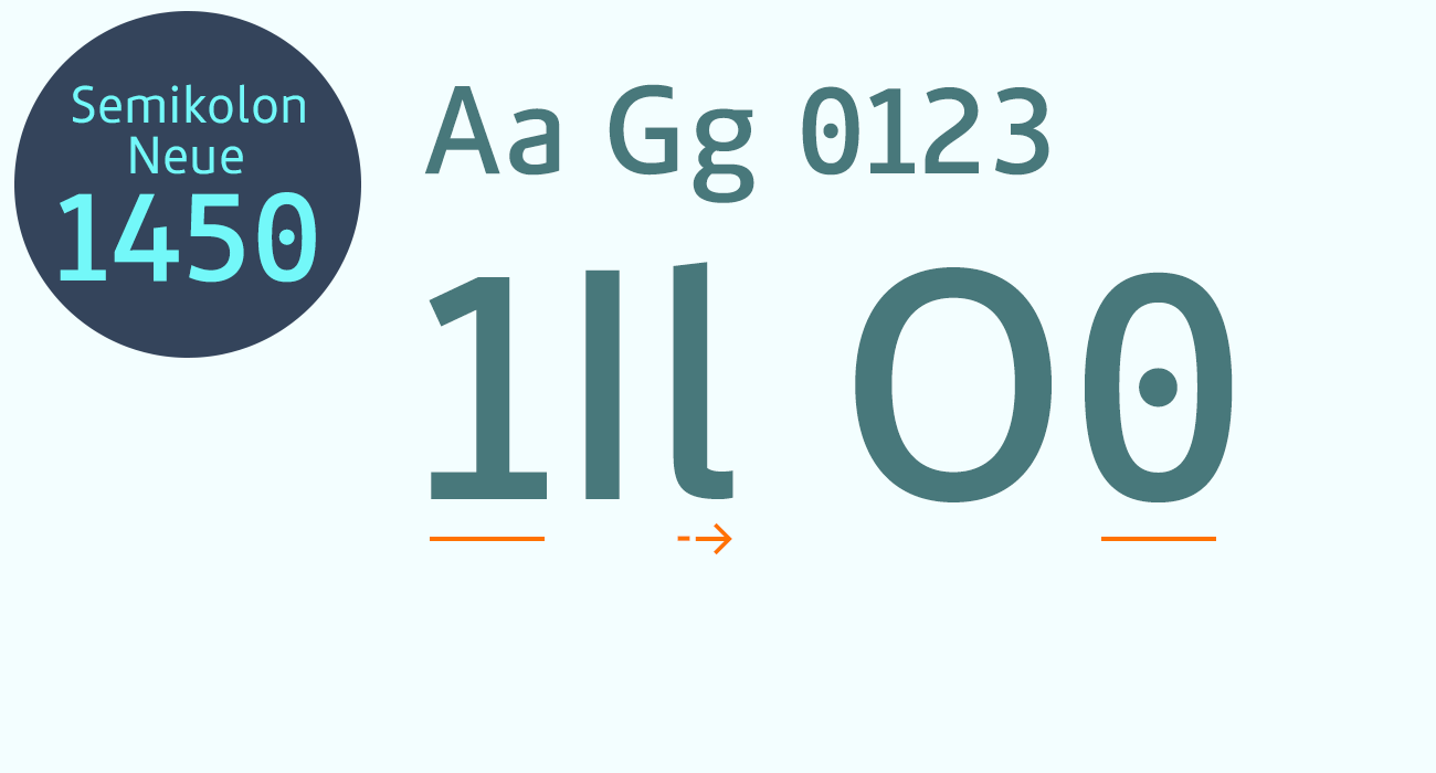
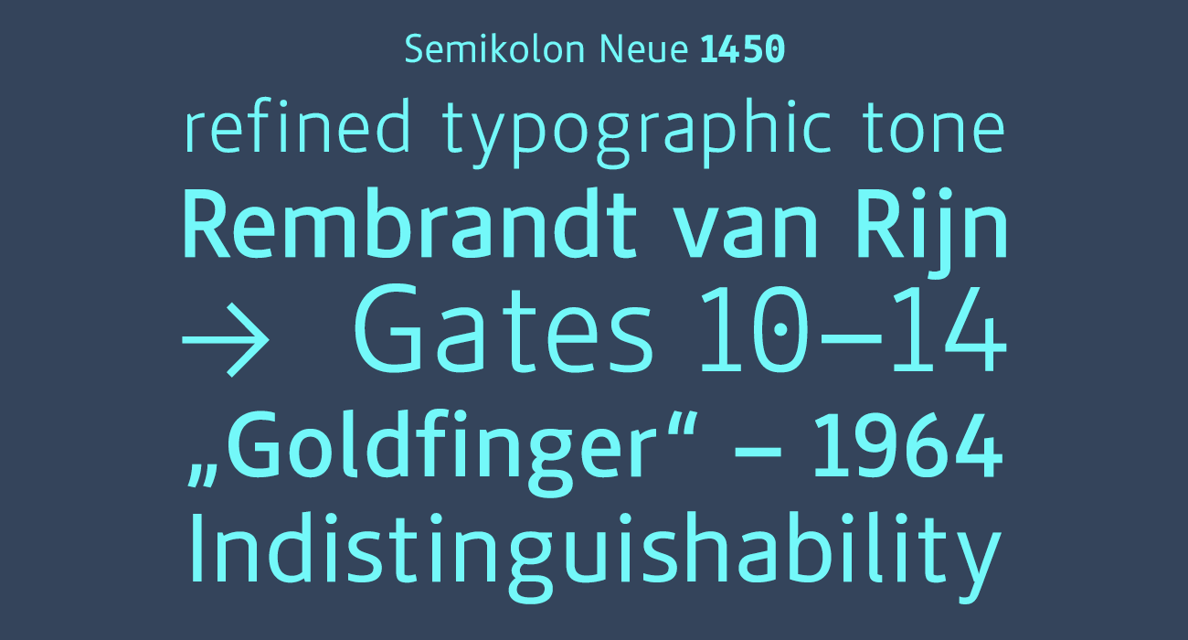
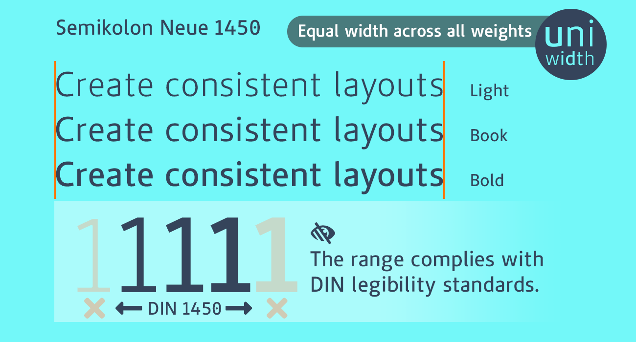
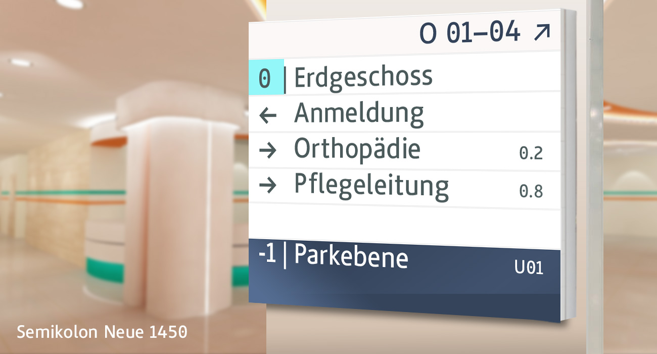
Semikolon Neue 1450
The DIN-1450–compliant typeface for maximum legibility.
- Meets all DIN 1450 legibility requirements
- Ideal for people with visual or reading impairments
- Optimized for wayfinding systems and public signage
- Versatile for print and digital applications
- Single fonts & package